Open ended charts now in brand colors
Fathom now lets you set your own brand colors in the chart and dashboard. Set them once and see them everywhere ensuring brand consistency in all your outputs.
Whether you’re sharing results with clients, executives, or teammates, your charts can now reflect the same palette you use in decks, reports, and marketing. It’s a small change that makes your findings feel polished, on-brand, and presentation-ready without a single extra click.
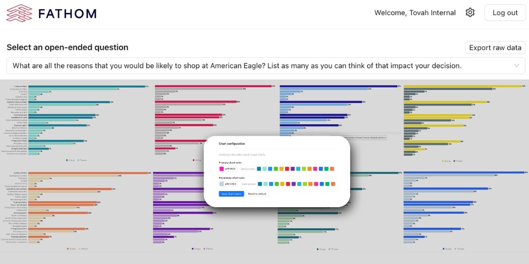
This update is now live for all Fathom users. Admins can set brand colors in Account Settings, and those choices instantly carry across every visualization.
💡 Want to dig into the details?
We’ve posted a quick walkthrough in our Knowledge Base if you’d like a step-by-step guide.
Big thanks to the researchers and teams who requested this feature. You inspire the refinements that make Fathom better every day. We can’t wait to see your insights shine in full color.